
After I analyzed the hitter projections this week, you were left wondering how those same projection systems did for the pitchers of the baseball world in 2014. Have no fear, my fantasy baseball friends, because the time has come to see who did the best when it came to pitching now.
In the years that I’ve been looking at this, Steamer has always done an admirable job at projecting pitchers while the Fangraphs Fans have always shared the spotlight with strong performances too. They both have their separate strengths with one being a scientific system and the other being crowdsourced human opinions. History may not be the best indicator of 2014 success though because we saw that the previously great Steamer had a rough year with hitter projections already. Will we see things change here with the pitchers too?
For a profile of the main projection systems, you can read my linked post from last year about them (broken into the categories of Age Regression systems, Comparable Player systems and the Human Element systems). As with the hitter analysis, I’m including Guru and RotoChamp projections this time around. However, the CBS projections did not have all the data that I needed for this analysis so I could not include them as well in this study.
To reiterate what I mentioned in the hitter post, I’m doing this analysis for fantasy baseball draft purposes. I’m not trying to analyze the projections for any purpose beyond trying to see who gave the best projections for last year’s pool of draftable pitchers. Yes, other pitchers emerged during this season but this is about your draft day.
The Projection Sources
In addition to the sources that I already listed above, I’ll be analyzing some of our usual competitors (which you can read about in my previous projection introduction post):
- Steamer
- ZiPS
- CAIRO
- Oliver
- Marcel
- Clay Davenport
- MORPS
- Fangraphs
- Mr. Cheatsheet’s Special Blend – For those unfamiliar, this is where I combine the projections into a master projection but I apply different weighting of the combinations for each individual stat to try to come up with the best possible combination of available projections.
The Method
This method follows a similar process to the hitter analysis. The first thing I attempt to do is I take all of the main stats that we want to analyze in the projections and then I standardize it so that we’re comparing the projected z-score (how many standard deviations above/below average the projection is for that universe) as opposed to comparing the actual projection to the actual result. This is because we want to know how that individual projection rates within that universe of projections. We’re really trying to know who was projected as above average or below average in those stats and testing to see if that ended up being true.
For pitchers, I only used four stats for this analysis. Though there are five standard rotisserie categories, projecting Saves is really a fool’s errand and not something that all projections do. The stats that were compared were wins, strikeouts, ERA and WHIP. I did adjust ERA and WHIP for fantasy purposes to basically weight them by innings pitched (low or high ERA/WHIP over more innings has a more positive or negative impact).
So with my projected and actual z-scores in those four stats, I used Mean Absolute Error (MAE) to compare the results. This averages the difference between the projected z-score and actual z-score in each stat.
Since this is specifically analyzing how valuable the projections were on draft day, I only included players in this analysis that were actually drafted in most leagues last year and were also shared among all of these analyzed projection systems. If a player played in an extremely limited capacity last year, I removed them as well so they didn’t skew the results too much. After this was done, I was left with a pool of 131 pitchers to compare.
The Initial Results
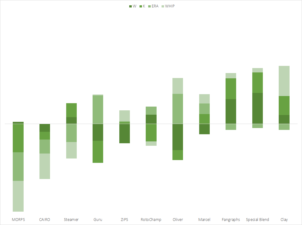
Knowing how well Steamer had done at projecting pitchers in the past with pitcher projections, my assumption was that we’d see more of the same but, as we saw in the hitter results, the story changed a little bit this year for pitchers. Here are how the systems ranked in each of the statistics that I analyzed:
| W | K | ERA | WHIP | Avg Rank | |
| Special Blend |
1
|
2
|
6 | 6 | 3.75 |
| Clay | 4 | 3 | 7 |
1
|
3.75 |
| Fangraphs |
2
|
1
|
8 | 5 | 4 |
| Marcel | 8 | 5 | 3 | 4 | 5 |
| Oliver | 11 | 8 |
1
|
2
|
5.5 |
| ZiPS | 10 | 6 | 5 | 3 | 6 |
| RotoChamp | 3 | 9 | 4 | 8 | 6 |
| Steamer | 5 | 4 | 10 | 9 | 7 |
| Guru | 9 | 10 |
2
|
7 | 7 |
| CAIRO | 7 | 7 | 9 | 10 | 8.25 |
| MORPS | 6 | 11 | 11 | 11 | 9.75 |
I was happy to see that my Special Blend of projections tied for first because it finished in the middle of the pack last year and that wasn’t a good sign for how I was weighting the various pitching projections. That being said, it still could have done better, especially in the vital ERA and WHIP categories.
The systems that actually did the best in the ERA and WHIP categories were the basic Age Regression systems of Marcel, Oliver and Guru. While they struggled at predicting strikeout and wins, they were the best systems for predicting the rate-based stats of ERA and WHIP.
The system that did best at predicted those strikeouts and wins was the human-based Fangraphs system. Those two stats are a bit reliant on playing time and usually the systems that rely on people to project playing time do the best in that regard so it’s not a total surprise to see Fangraphs do well there. This was true in last year’s analysis too where Steamer had the best projections but struggled with Wins and K’s while Fangraphs did quite well.
To see just how high or low each system ranked in those categories, check out the chart below.
The Results Per IP
When I did my hitter analysis, I also looked at how the projections broke down when playing time was essentially eliminated from the projections. I wanted to do the same for pitchers but it’s a bit tricky to get exactly right. The best way to do it would be if I could get projections for Wins per Games and K% but, of course, not all projections get that deep. I opted to work with what I had available and I broke it down to wins and strikeouts per inning pitched and removed any playing time related weights from ERA and WHIP that I used above. If nothing else, it will at least give a slight look into seeing how the systems performed without playing time projections being such a big factor.
Here are how the systems ranked in this version of the analysis:
| W | K | ERA | WHIP | Avg Rank | |
| Fangraphs |
1
|
7 |
2
|
5 | 3.75 |
| ZiPS | 6 | 3 | 7 |
2
|
4.5 |
| RotoChamp |
2
|
8 | 5 | 3 | 4.5 |
| Special Blend | 8 |
1
|
4 | 6 | 4.75 |
| Oliver | 10 | 6 |
1
|
4 | 5.25 |
| Guru | 4 | 11 | 3 | 7 | 6.25 |
| CAIRO | 5 | 4 | 10 | 9 | 7 |
| Clay | 9 | 9 | 9 |
1
|
7 |
| Steamer | 11 |
2
|
6 | 10 | 7.25 |
| MORPS | 3 | 5 | 11 | 11 | 7.5 |
| Marcel | 7 | 10 | 8 | 8 | 8.25 |
Fangraphs was able to find their way on top with their crowdsourced projections and we saw a shifting in the other systems with ZiPS benefiting the most from this change. My Special Blend of projections took a slight hit and so did Clay Davenport here.
When we look at the chart below to see exactly how these systems rated out, there’s still not a ton of separation between the top few systems. While there’s winners and losers, it’s a pretty close race here.

Conclusions
It jumps out to me just how there really wasn’t any system that differentiated themselves from the others here. In the past, it’s usually pretty clear to see who had the best or worst system and that wasn’t the case this year.
Some conclusions that we can draw are that the basic systems like Marcel do a fine job when it comes to ERA and WHIP while the systems that allow human intervention to help with playing time projections (Fangraphs) do well with wins and strikeouts. With that in mind, I’m going to work on tweaking my Special Blend of projections to try to find a better system for next season. I’ll publish my findings in the near future.
Winners
I’d like to give out an award for the top three systems but this was just too damn close and there really wasn’t a clear-cut winner, let alone three. I’d say Fangraphs did the best job in both variations of the analysis while Clay Davenport kicked butt when it came to his WHIP projections. Beyond that, it’s hard to say anyone really stood out from the pack this year. With all of that in mind, I’ll say the top two projections from last season were:


503050c8-b967-11e4-8b4b-9f818cc1e1fc
02/21/2015 at 1:17 AMStill pretty impressive results for your "Special Blend". If you plan on tweaking your weights, I would consider tweaking them based on the results over the past few seasons. Don't want to over tweak based on a single season of results.
Also, any plans to add your "Special Blend" to your Excel cheat sheet once all of the projections are out?