This is the second part of my annual series to analyze the accuracy of last year’s baseball projections. The hope is that this will give you a better idea as to what projections you should use on your fantasy baseball draft day this year. In the first part, I analyzed how well each system projected hitters and I did that separately than pitchers because there are usually different ways of projecting hitters versus pitchers. While Steamer had the top hitter projections four of the past five years, the winner for best pitcher projections has bounced around between Steamer and the Fangraphs Fans for a few years before Clay Davenport’s projections came out of nowhere last year with some great work. Will this year’s results help clear up who truly is the best at projecting pitcher stats?
 The idea with this analysis is that it should solely look at the pitchers who were being drafted in fantasy baseball drafts last year to see which projection systems would have helped you the most had you used them. I won’t be looking to see who projected the best waiver wire wonders.
Once again, prior to getting started with the analysis here, I want to give a big shout-out to The Baseball Projection Project for archiving projections there each year. It’s a big help for tracking down ones I didn’t have from last year.
The Projection Sources
There are twelve different projection sources included in this year’s analysis. These are the same projections I used in the hitter analysis but, if you did not read that, here is a recap on which projections are included and the methodology behind each of them:
- Marcel (4th place in last year’s analysis) – This is as simple as baseball projections get. Marcel was developed by Tom Tango and it takes the past three years of player data, puts more weight on the most recent years and then regresses the results based on the player’s age.
- Steamer (9th place last year) – Steamer uses five years of player data and treats each stat differently for regression purposes so each component within their projections basically uses a different projection system. Despite a 5th place finish last year, Steamer finished 1st in 2012-2014.
- CAIRO (10th place last year) – From Replacement Level Yankees Weblog, it weights three years of stats like Marcel but then also regresses the results not only for age but regresses differently depending on which position the player plays. In addition, certain statistics are regressed differently than others.
- ZiPS (7th place last year) – Developed by Dan Szymborski, this system takes the past four years of stats for each player, weights the more recent years heavily but then takes those results to look for comparable historical players to determine the aging regression trend to apply.
- Clay Davenport (1st place last year) – This method also looks for comparable players like ZiPS but then applies playing time weights and redistributes the stats afterwards based on team projections and to mimic last year’s league totals.
- MORPS (11th place last year) – Like CAIRO, MORPS takes four years of player data for weighting and then does regression dependent on player position but also player league (AL or NL) then applies playing time projections based on current depth charts.
- Razzball (not in last year’s analysis) – These projections were downloaded from the Baseball Projection Projection under the name of Razzball (as opposed to Steamer Razzball) and I believe they are not done with any computer model but I don’t have details on this.
- ESPN (not in last year’s analysis) – These are done by ESPN staff and are not done via a scientific method like those mentioned above. The human element!
- CBS (not in last year’s analysis) – Same as ESPN but by CBS staff in this case.
- Fangraphs Fans (3rd place last year) – This is a crowdsourced projection where users of Fangraphs can project a player and this averages all of those projections.
- Fangraphs Depth Chart (not in last year’s analysis) – This is the first of our combination projections. First, it combines ZiPS and Steamer projections and then playing time is done by Fangraphs staff as opposed to letting the projections predict playing time.
- Mr. Cheatsheet’s Special Blend (2nd place last year) – Like the Fangraphs Depth Chart, this combines other projections. However, each stat uses a different weighting system for the combination of projections. However, unlike Fangraphs Depth Chart, this lets the projection systems predict playing time.
The Method
The ideas and methods behind analyzing the pitchers here are basically the same as what I did for the hitters. The first thing to understand is that we’re not necessarily worried about the projections directly matching the actual end-of-year total. Instead, we’re more worried about whether a projection system is accurate in telling you how far above or below average each player is within those projections. It’s okay if a system awards strikeouts more generously than other systems because we’re mainly curious at who they projected to do well within their universe.
In order to understand who was rated above or below average in a projected statistic, I start by taking all of the main stats that we want to analyze in the projections and standardizing them so that we’re actually comparing the projected z-score results for each player (the z-score is how many standard deviations above/below average that projection is within that system). We’re basically trying to determine which players were projected as above average or below average in those stats and then testing to see if that ended up being true in real-life.
For pitchers, I only used four stats for this analysis. I’m still sticking to the main 5×5 roto categories but projecting Saves is almost impossible because it is up to a manager’s decision and it is not something that all projections systems even try to project. For the analysis, I did adjust ERA and WHIP for fantasy purposes to weight them by innings pitched (low or high ERA/WHIP over more innings has a more positive or negative impact overall).
I used Mean Absolute Error (MAE) to compare the projected versus actual z-scores for each the four stats. MAE is helpful for our particular analysis because it averages the difference between the projected z-score and actual z-score in each stat. Another option for this type of analysis is using Root Mean Squared Error (RMSE) but MAE is my preference because it won’t penalize large mistakes as harshly as RMSE and that’s good for an analysis such as this where there’s the possibility to bench injured players or under-performing players in fantasy baseball.
Since this is specifically analyzing how valuable the projections were on draft day, I only included players in this analysis that were actually drafted in most leagues last preseason and were also shared among all of these analyzed projection systems. If a player played in an extremely limited capacity last year, I removed them as well so they didn’t skew the results. This left me with a pool of 131 pitchers to analyze.
The Initial Results
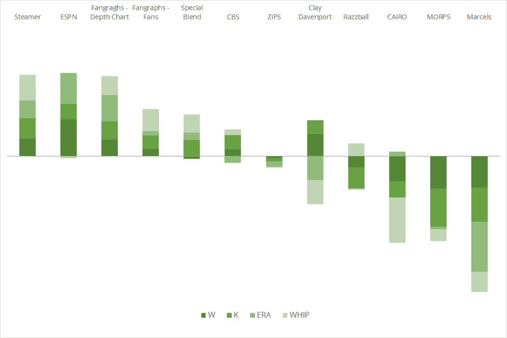
In my initial analysis, I looked at how well the projections did based on the data they published, including how many innings they projected each pitcher to pitch. I’ve found that there are really two key elements to projections: good data and good playing time projections. This analyzes both. Here is how the twelve competitors ranked in those four stats:
| W | K | ERA | WHIP | Avg Rank | |
| Steamer | 3 | 1 | 3 | 1 | 2.0 |
| Fangraghs – Depth Chart | 4 | 2 | 2 | 4 | 3.0 |
| ESPN | 1 | 4 | 1 | 8 | 3.5 |
| Special Blend | 8 | 3 | 4 | 3 | 4.5 |
| Fangraphs – Fans | 5 | 7 | 6 | 2 | 5.0 |
| CBS | 6 | 5 | 10 | 6 | 6.8 |
| Clay Davenport | 2 | 6 | 11 | 11 | 7.5 |
| ZiPS | 7 | 8 | 9 | 7 | 7.8 |
| Razzball | 9 | 10 | 7 | 5 | 7.8 |
| CAIRO | 10 | 9 | 5 | 12 | 9.0 |
| MORPS | 12 | 12 | 8 | 9 | 10.3 |
| Marcels | 11 | 11 | 12 | 10 | 11.0 |
As you can see, Steamer is back on top. Last year when I did this, Steamer fell to the back of the pack for some reason but they regain the crown for best overall projection. The amazing thing is that they performed even better than the combination projections which used parts of their projections (Fangraphs’ Depth Charts and my Special Blend). Even combining projections couldn’t do as well as Steamer did on its own. That’s highly impressive.
Outside of that, the combined projections did well as they both were in the top four. The rest of the top six was filled with human-based projections done by CBS, ESPN and Fangraphs’ Fans. Beyond that, the age regression systems and everyone else struggled.
To see just how well each system performed in those categories, this chart breaks down their performance and how far above or below average it was in each category:
The Results With Playing Time Excluded
I noted above that there are two parts to great projections: good data and good playing time projections. When I analyzed the hitters in part one of this series, I broke out the data to analyze it independently of playing time by looking at per-AB averages for each stat. For pitching, it is a bit trickier based on the data I have available in projections. To me, the best way to analyze this would be to look at Wins per Games and K% then base ERA and WHIP to really get a sense of the projections independent of playing time. Not all projections include the data though so I cannot do that. Instead I was able to use Wins and Strikeouts per inning pitched and I removed any playing time related weights from ERA and WHIP which were used in the initial analysis. If nothing else, it will at least give a slight look into seeing how the systems performed without playing time projections being such a big factor.
| W | K | ERA | WHIP | Avg Rank | Change from Initial | |
| Steamer | 2 | 4 | 1 | 3 | 2.5 | -0.5 |
| Fangraphs – Fans | 1 | 3 | 3 | 4 | 2.8 | +2.3 |
| Fangraghs – Depth Chart | 6 | 1 | 2 | 2 | 2.8 | +0.3 |
| Special Blend | 7 | 2 | 7 | 1 | 4.3 | +0.3 |
| CBS | 3 | 5 | 4 | 5 | 4.3 | +2.6 |
| ESPN | 5 | 8 | 5 | 8 | 6.5 | -3.0 |
| ZiPS | 8 | 7 | 6 | 6 | 6.8 | +1.1 |
| Razzball | 11 | 10 | 8 | 7 | 9.0 | -1.2 |
| CAIRO | 4 | 11 | 10 | 12 | 9.3 | -0.3 |
| MORPS | 10 | 9 | 9 | 9 | 9.3 | +1.1 |
| Marcels | 12 | 6 | 12 | 11 | 10.3 | +0.8 |
| Clay Davenport | 9 | 12 | 11 | 10 | 10.5 | -1.5 |
The projections that went up in rankings would show that they did better when playing time wasn’t a factor in their projections (meaning they didn’t do a great job projecting playing time). I’m surprised to see the human systems of Fangraphs’ Fans and CBS move up without playing time. Regardless, there isn’t a huge shakeup here as the champ is still Steamer even in this version of the analysis!
Conclusions
Personally I drew a lot of conclusions about my own Special Blend of projections. I really would expect them to perform better in this analysis but there’s something about that Steamer projection that is hard to beat on its own. That being said, I spent time to reconfigure my Special Blend projections for 2016 and saw a significant improvement when I applied those changes to the 2015 version as well (it basically tied Steamer but, hey, it’s still progress compared to what we see here).
Outside of that, the conclusion that I see is that the human-based systems do very well when it comes to pitching. I would venture to guess that means that it’s harder to use past data to predict pitcher performance but Steamer proves me wrong in that department. Regardless, many computer projections struggle here while they do much better with hitters.
The Winner for the Best 2015 Fantasy Baseball Projections!
If you read this far then you aren’t going to be surprised when I say that Steamer wins here. I don’t even have to put a caveat in to say that combined projections actually performed better because Steamer even outperformed them. That’s pretty damn good! Jared Cross and his team at Steamer Projections accomplished the rare feat of having both the best hitter and best pitcher projections in a given year. Good work!